Fly UX Case Study
The Problem
Fly UX is a fictional start-up airline, created by the UX design institute as part of the UX Design certification course.
The company is looking to create an easy and intuitive experience for their target users. The task is to create a website
with an easy user experience, focusing on the flight booking process.
My role was the sole UX researcher and designer. I completed 10 projects from the Research phase through the Wireframing stage.

Step 1: Research
The beginning of a UX project is the most important: the research phase. During research it’s important to find out as much information you can about your competitors and how they are (or aren’t) solving the same problem. It’s equally important to understand the users we are trying to solve for. The goal is to identify the goals, mental models, needs, attitudes and behaviors of our target users during the oftentimes frustrating flight booking process.
During the research phase I used 4 methods to identify problems in the current flight booking processes on our competitors’ websites: competitive benchmark, online survey, note-taking and usability test.
1. Competitive Benchmark
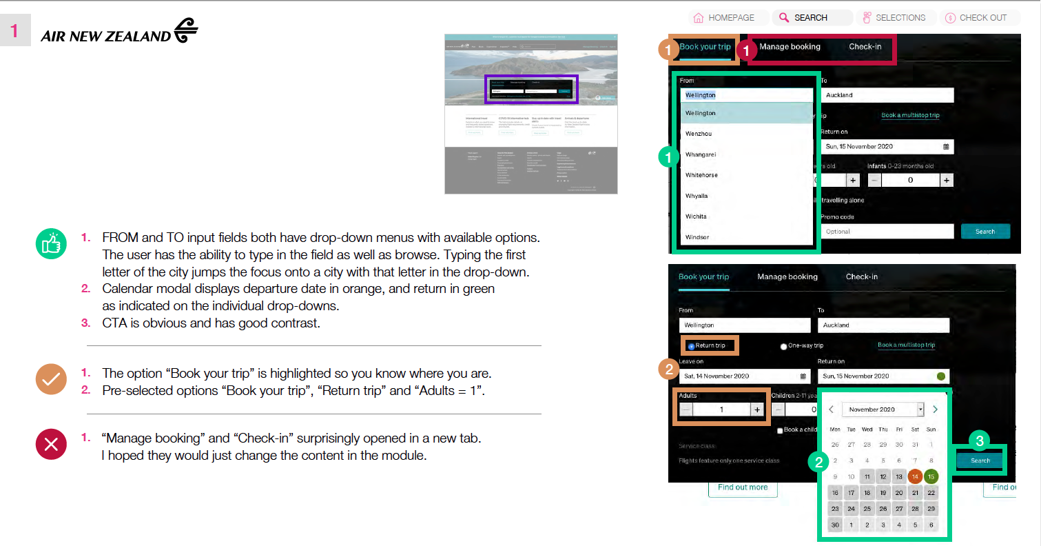
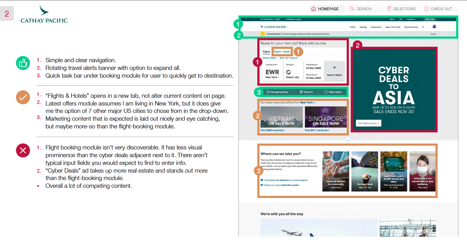
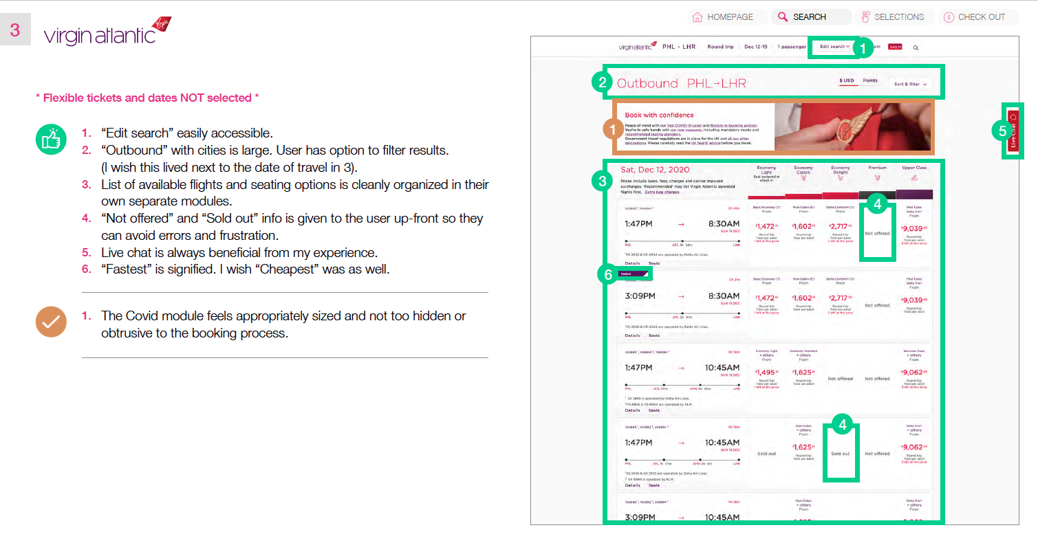
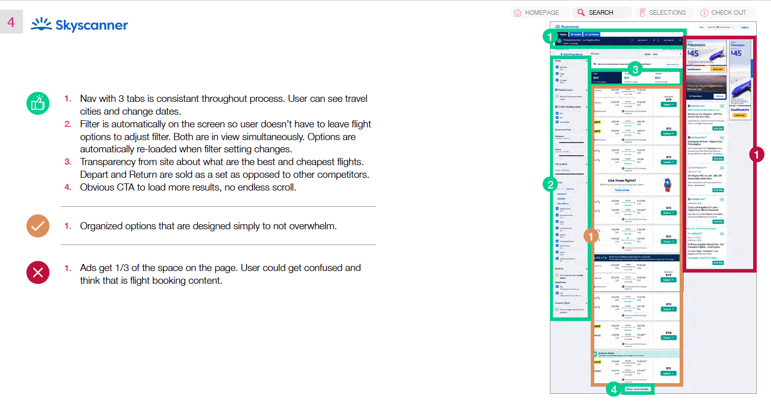
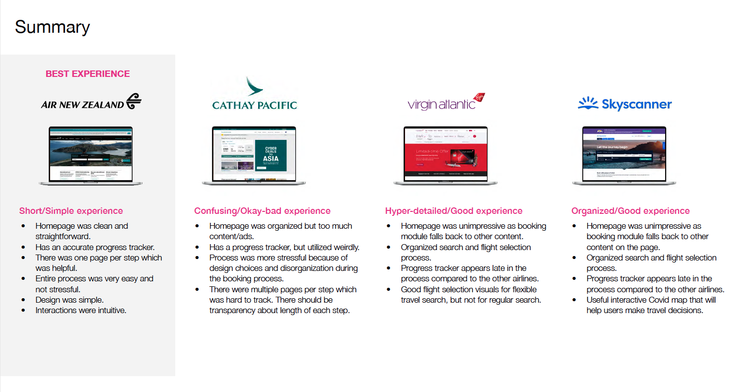
For this project I researched and analyzed 4 different airline websites. Air New Zealand, Cathay Pacific, Virgin Atlantic and Skyscanner. Some of which I am familiar with and others that I’m not. I navigated through the whole flight booking process on each competitor site and took notes on what was and wasn’t working. This proved to be an extremely helpful to understand current conventions that are currently being used as well as finding practices that can be improved.
2. Online Survey
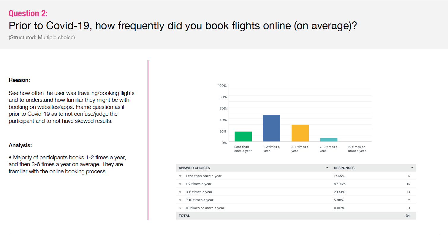
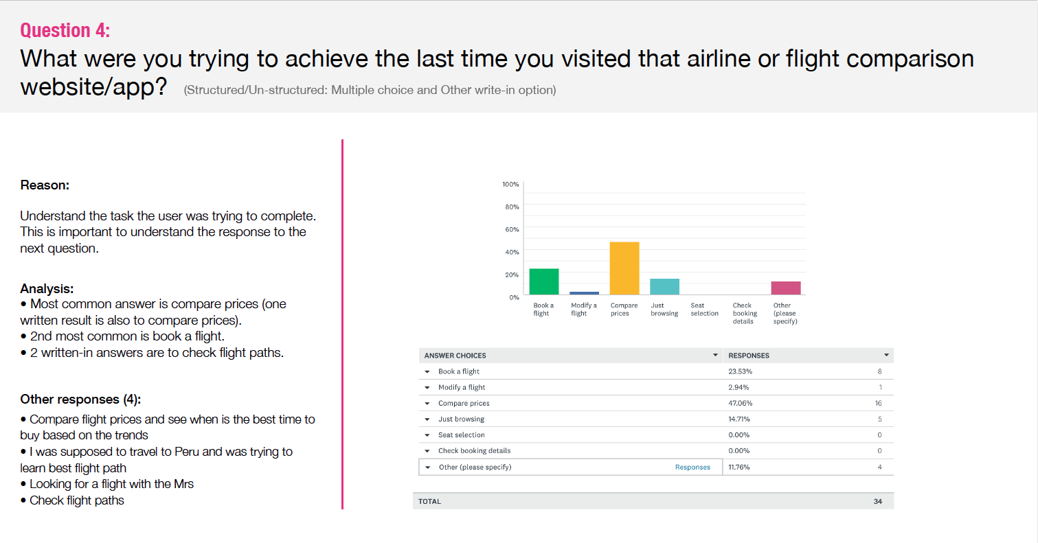
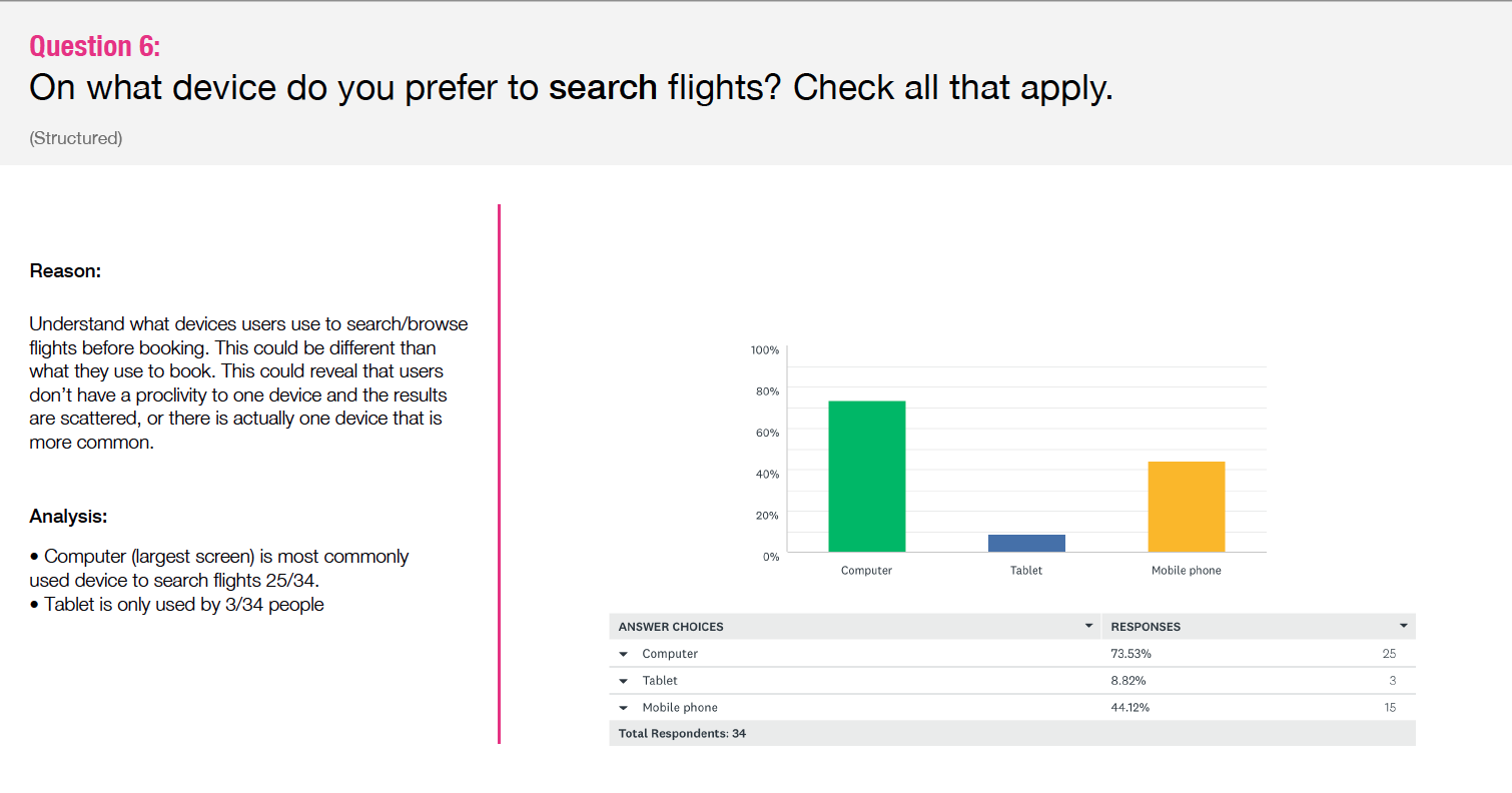
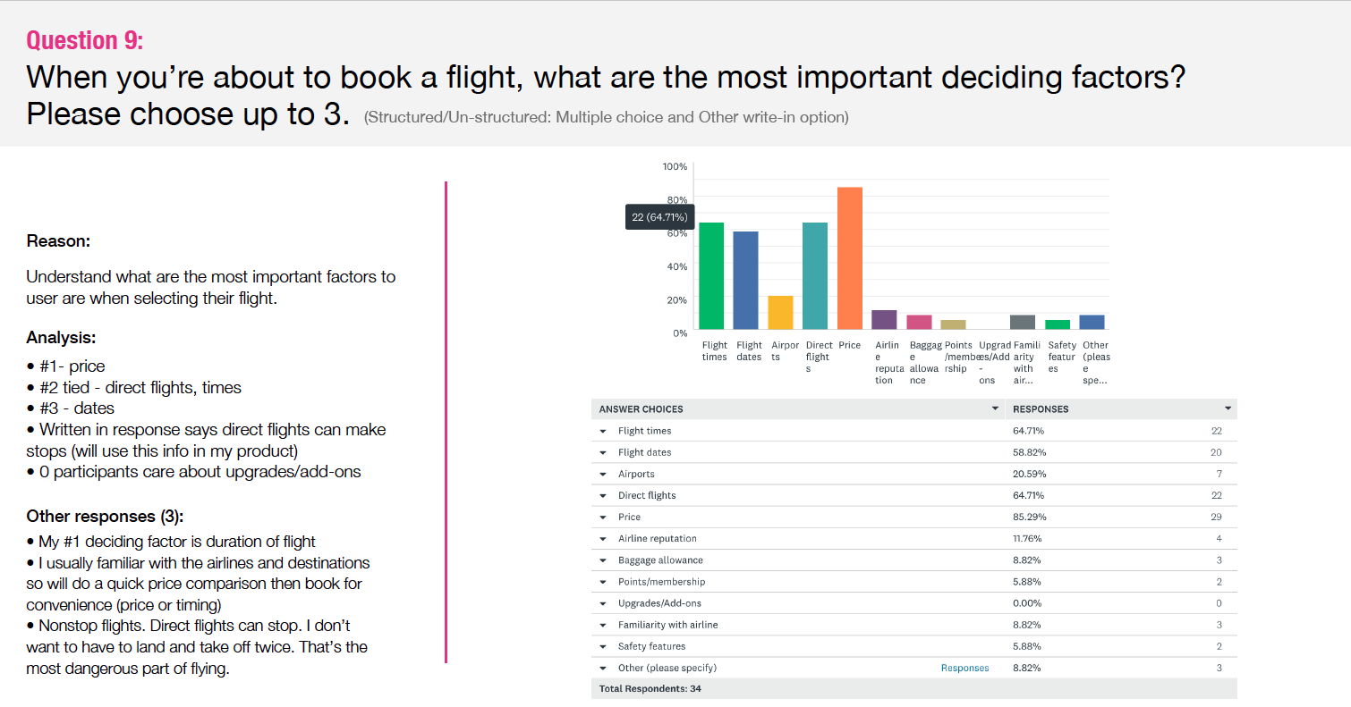
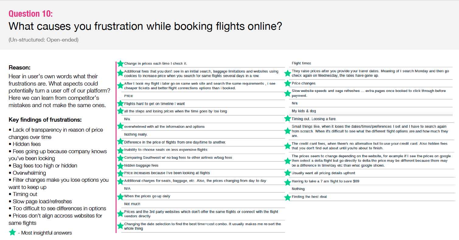
I created an online survey using Survey Monkey. The survey was short with only 10 questions: 9 structured and 1 open ended. I emailed this to friends and colleagues and received over 30 responses. What I was most interested in finding out was what are the most important factors when deciding on a flight, and what devices do you like to search and book flights on. I found that price was the most important for the former question, and computer was the most desirable device for the latter.
3. Note-taking
Good notes are an essential part of research. During this project I watched and took notes on 2 usability tests. I learned the value of usability testing as part of the UX process. I was able to establish a bank of insights from watching users try to navigate through competitor sites. The notes focused on mental models, goals, behaviors, context and pain points. In order to keep the notes organized and easily scannable for future reference, I used color and symbols to easily refer back to positives, negatives, pain points, quotes and ideas for the future.
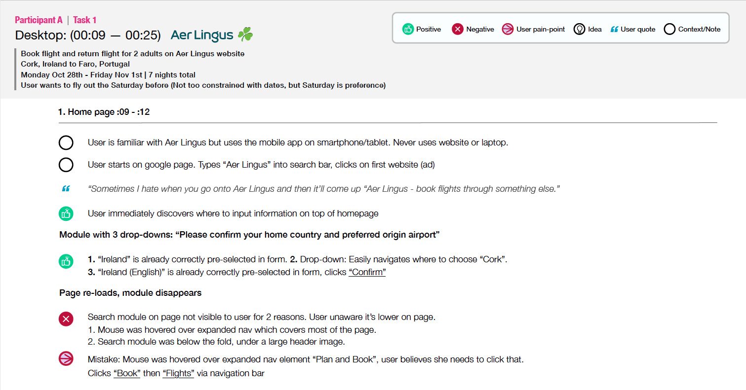
4. Usability Test
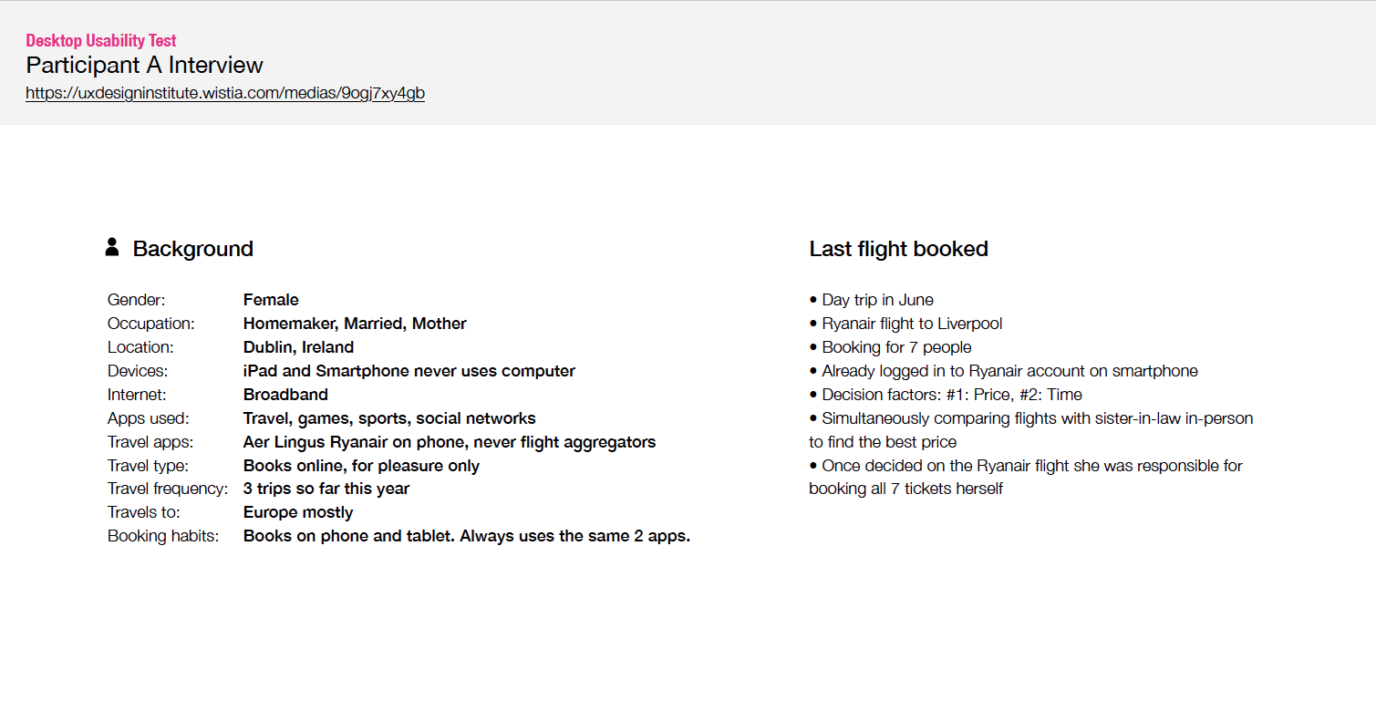
For the final step of research I conducted an in-person interview and usability test for two airline websites. While the first 3 methods of user research were very insightful, it was helpful to see first hand how a user interacts with the websites I had been analyzing. It was challenging and I learned a lot about not being biased while conducting a usability test. This also was great practice for note-taking.

Step 2: Analysis
After gathering a lot of research from step 1, it was time to start looking at all of the data. We are now in the analysis phase. This phase was very time consuming while I sorted through all of the previous projects and made as many notes as possible. I started to understand the problems that needed to be solved.
During this phase I created an affinity diagram and customer journey map.
5. Affinity Diagram
To create the affinity diagram, I went back through my first 4 projects another time. This time I took notes of every thing on sticky notes. One note/thought/idea per sticky. To keep it organized each research method had its own individual color. I used Miro (an online collaborative tool) to organize and group all of my findings. I made several groups, organizing the similar stickies together and labeling the groups. Then I broke them apart and made other groups, giving me my final diagram.
First Diagram
Second Diagram
6. Customer Journey Map
Now I was ready to add structure to all of my data and create a visualization of how the user flows through the flight booking experience. For my map I restructured all of my sticky notes into the order of action the user takes. I made note of the positives and negatives, as well as goals, behaviors, pain points, mental models and improvements that can be made.
Step 3: Design
After studying and organizing the research, it’s time to start thinking about the user flows. During this phase, I addressed how to fix issues I’ve uncovered and creating a better experience for the user based on the research and analysis phases.
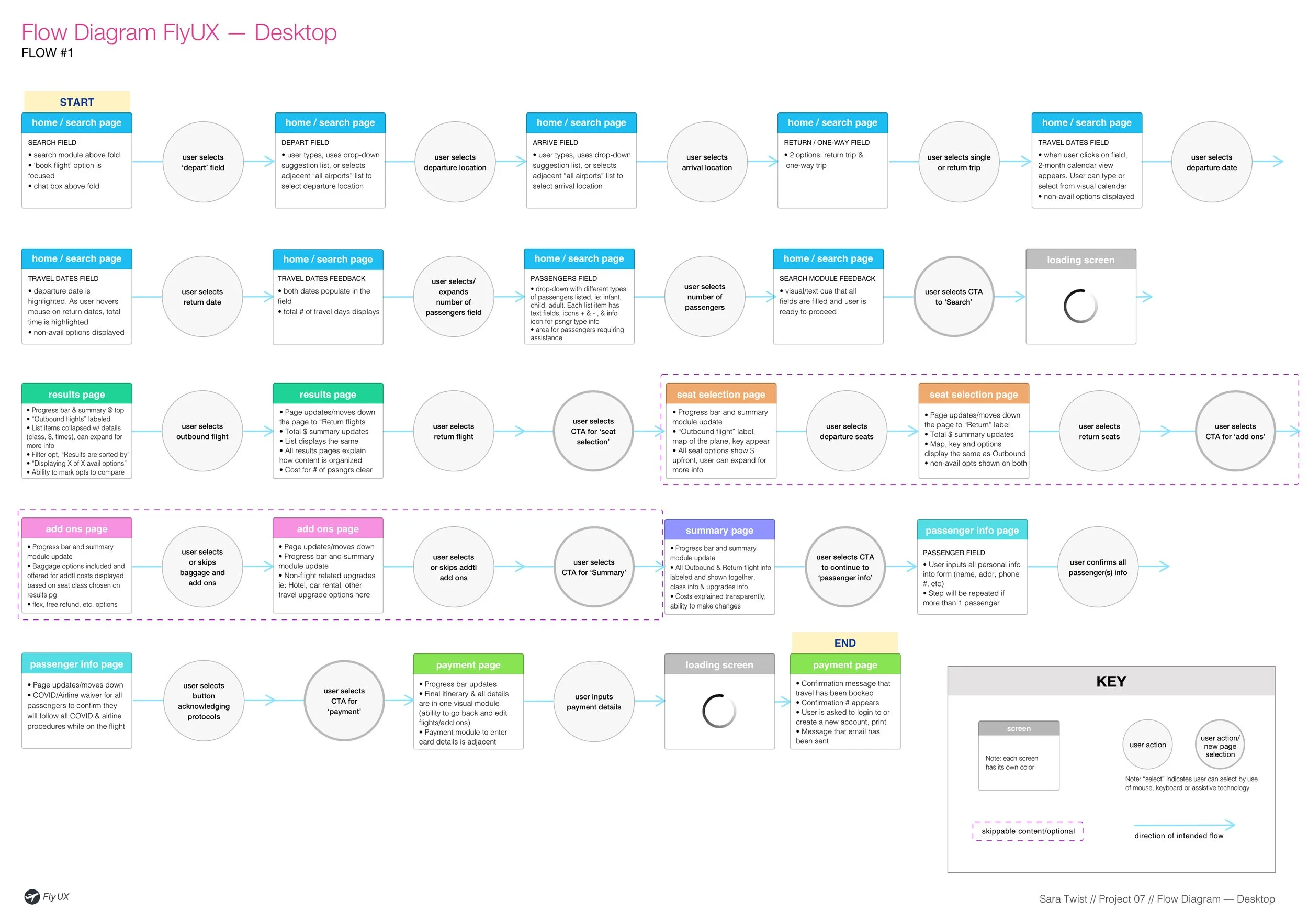
7. Flow Diagram
Like the Customer Journey Map, the Flow Diagram also follows a linear flow. For the Flow Diagram I chose the most common flow users take based on my research. The diagram contains each individual step a user would take from searching for flights through payment. Each screen or state is represented by a box, and each interaction is represented by a circle.
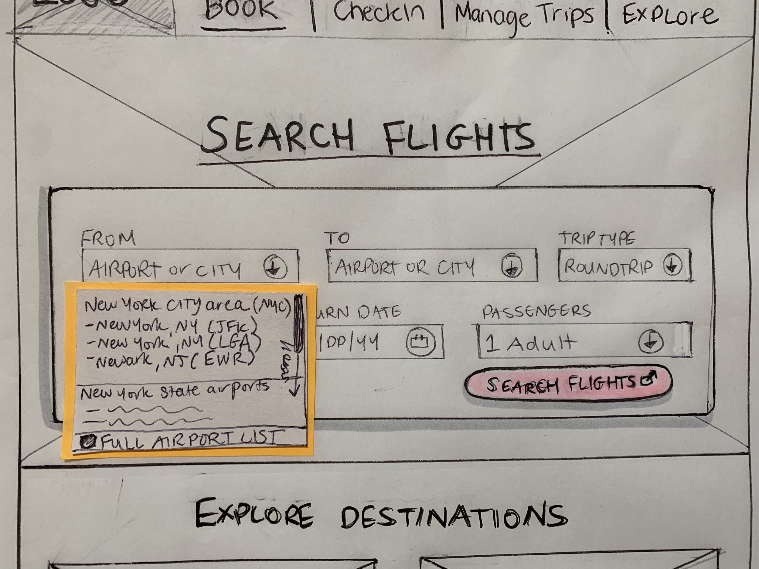
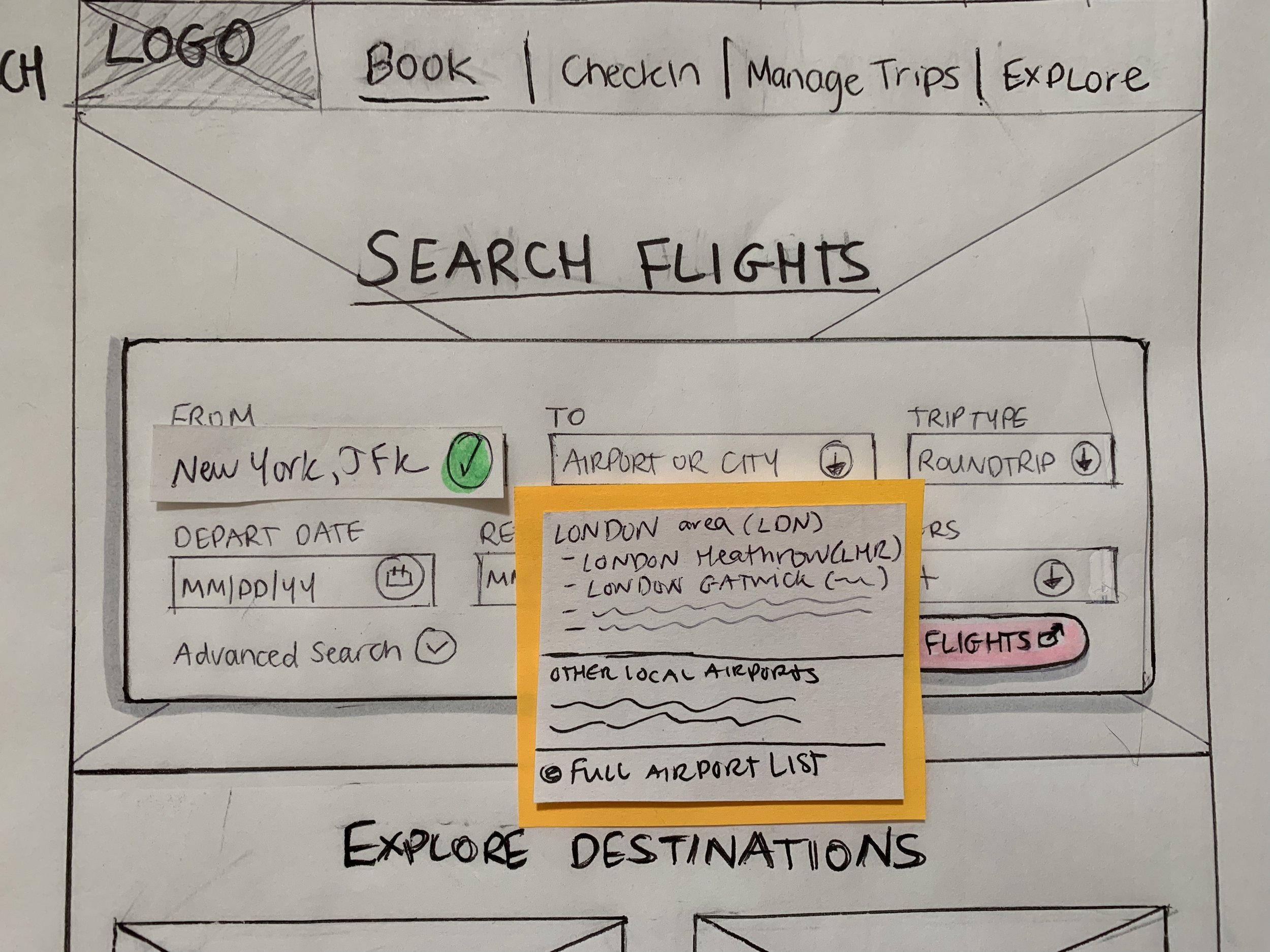
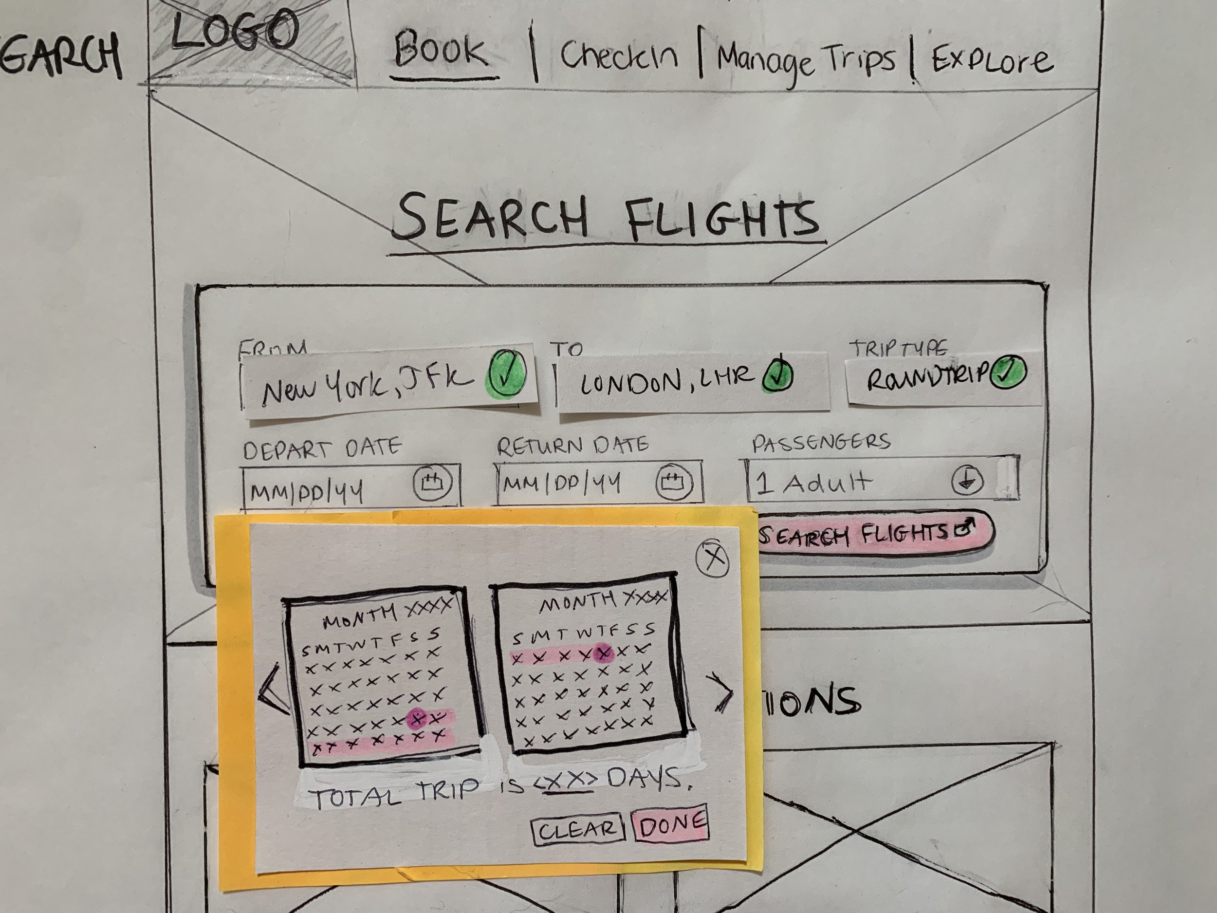
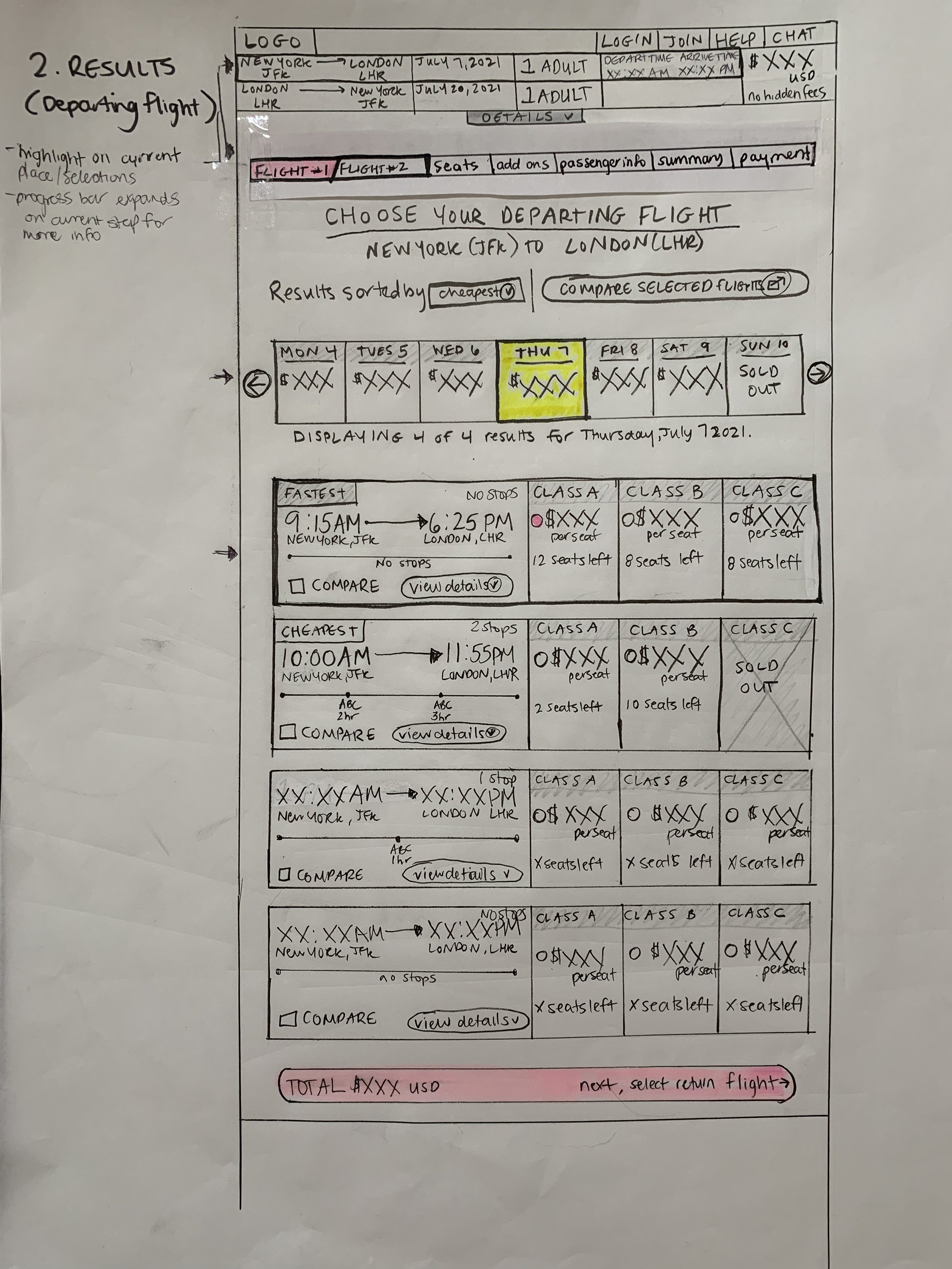
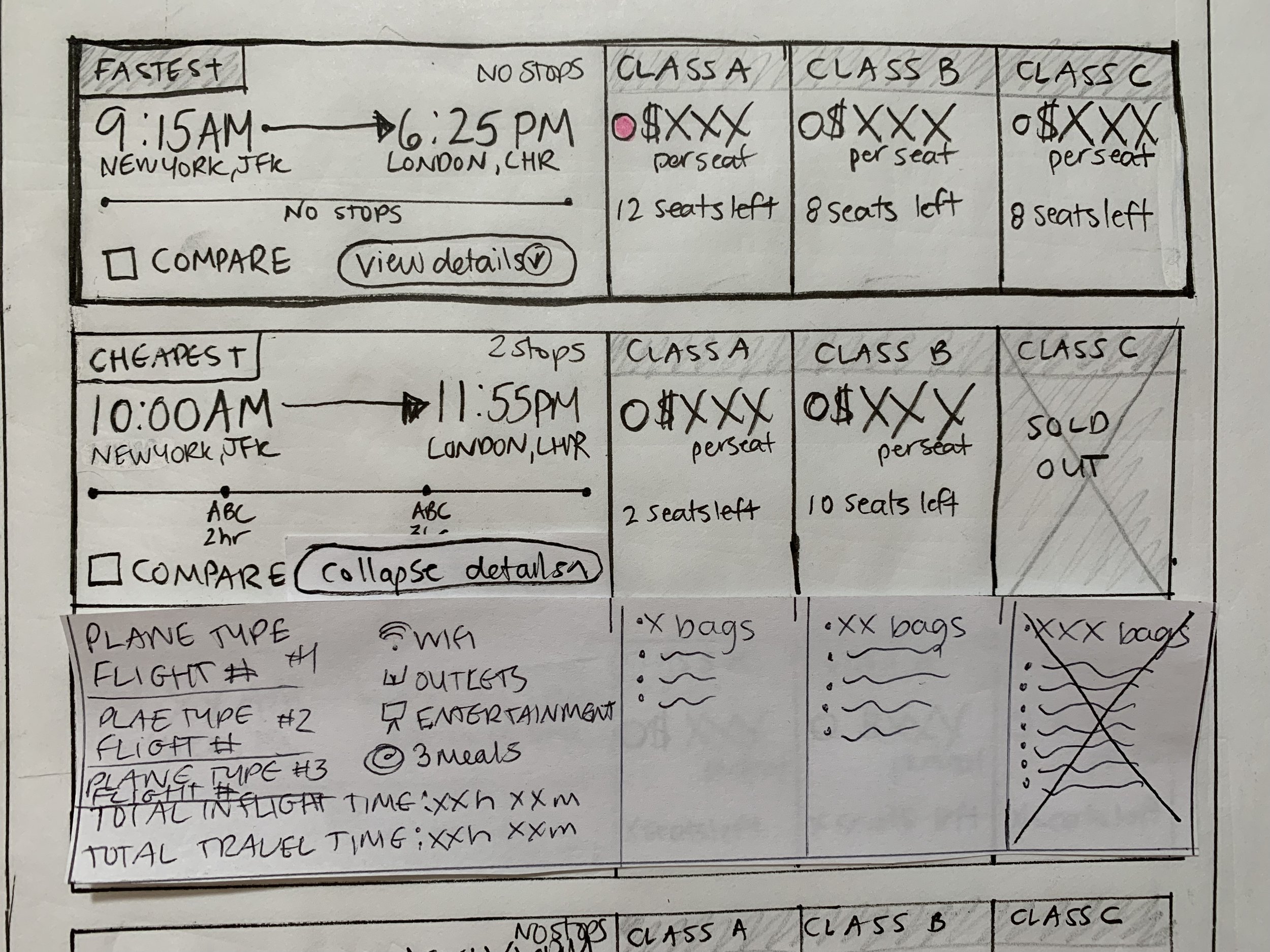
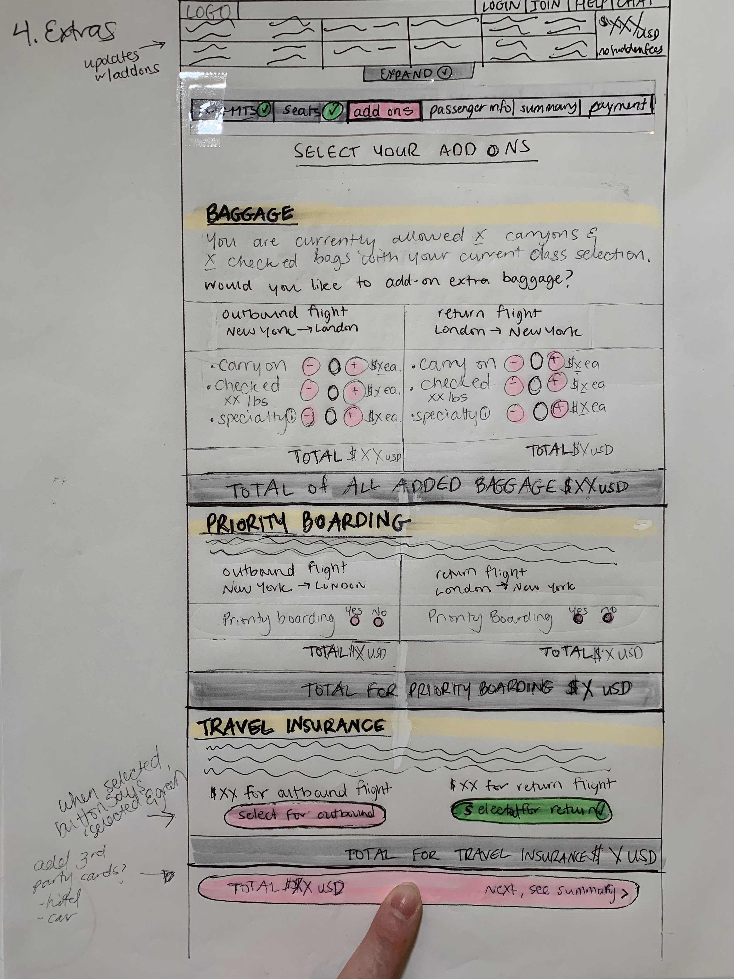
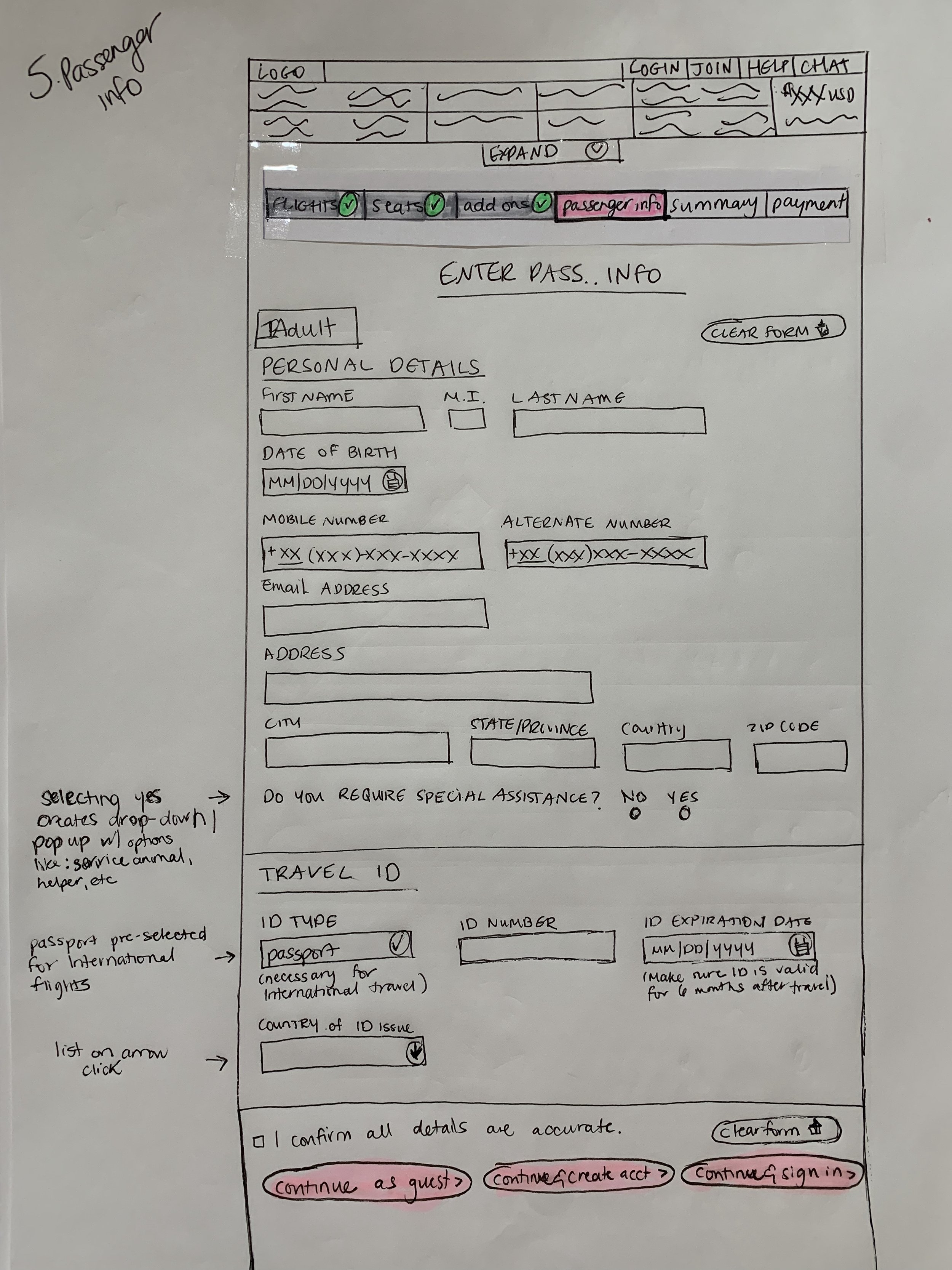
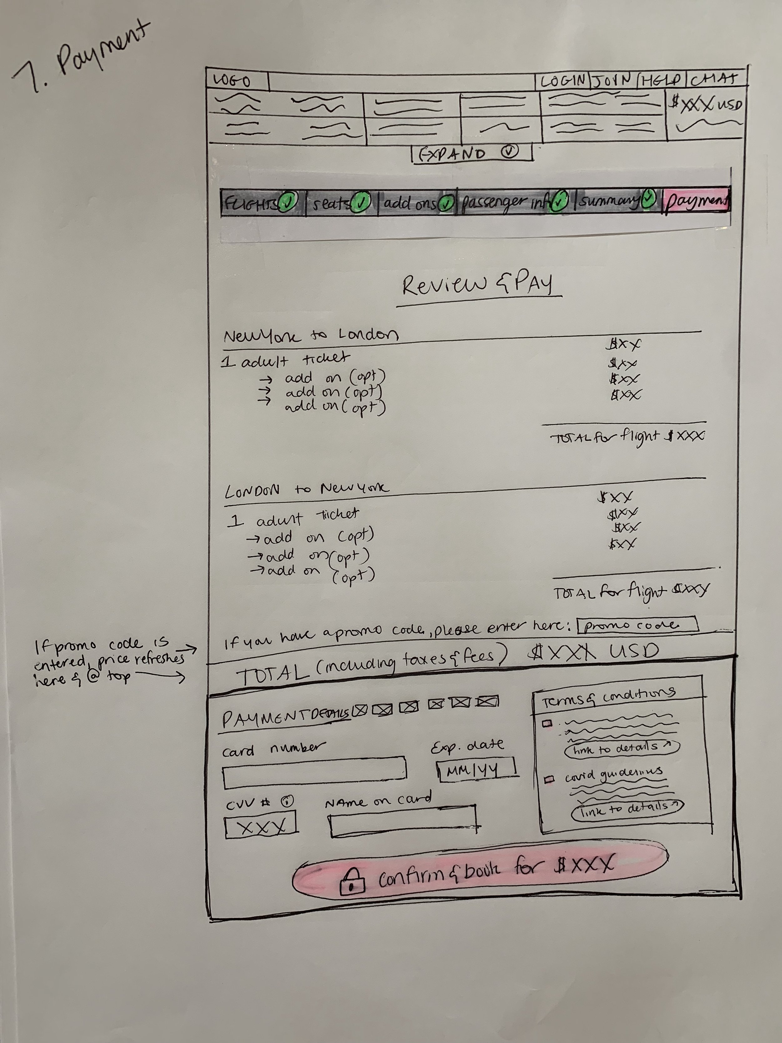
8. Interaction design/Low fidelity sketches
Relying on the Flow Diagram, it’s time to start sketching the screens and screen states. This is an important step to creating our flow before it is digitized. While sketching, I addressed the issues and user goals that were identified in the research and analysis phases.
Step 4: Prototyping
9. Medium Fidelity Prototype
After defining most of the solution with my flow diagram and sketches, it’s time to add in more detail with interactivity. I created a medium-fidelity prototype with Sketch and Invision.
Step 5: Wireframing
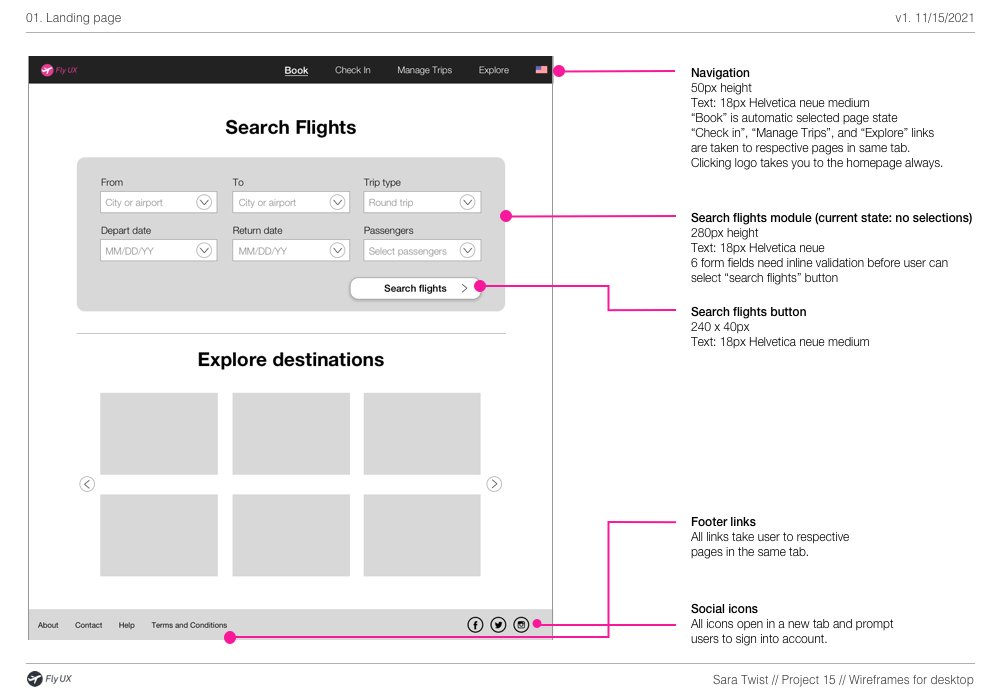
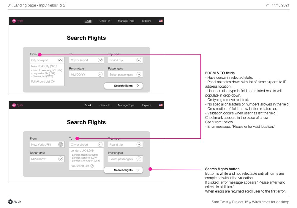
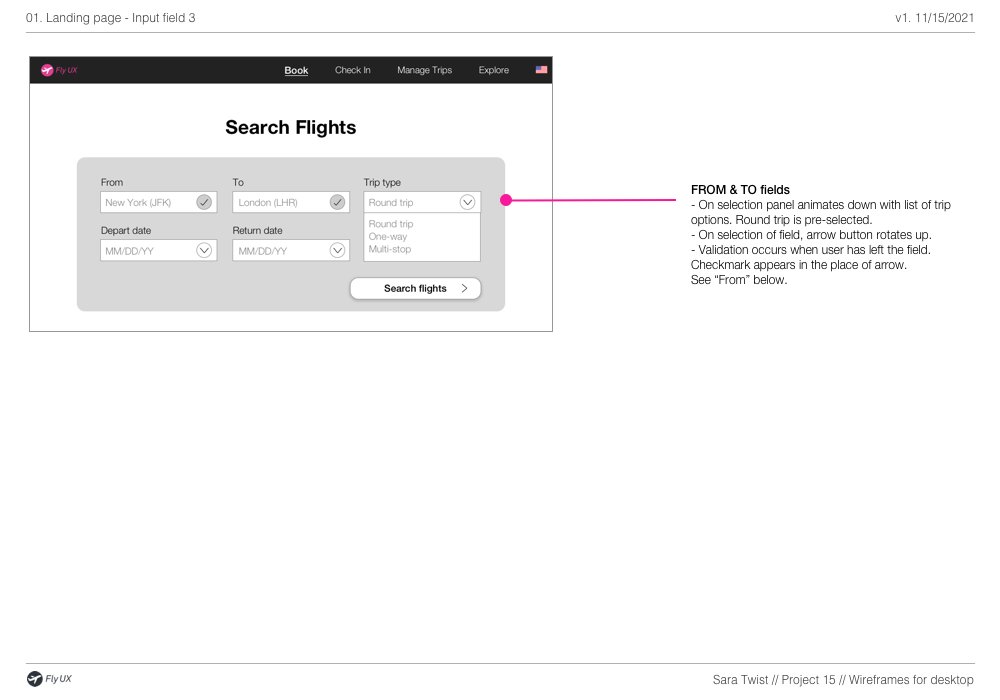
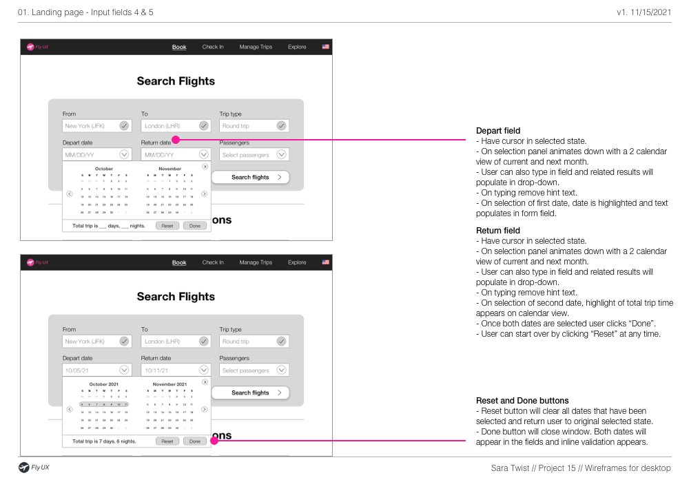
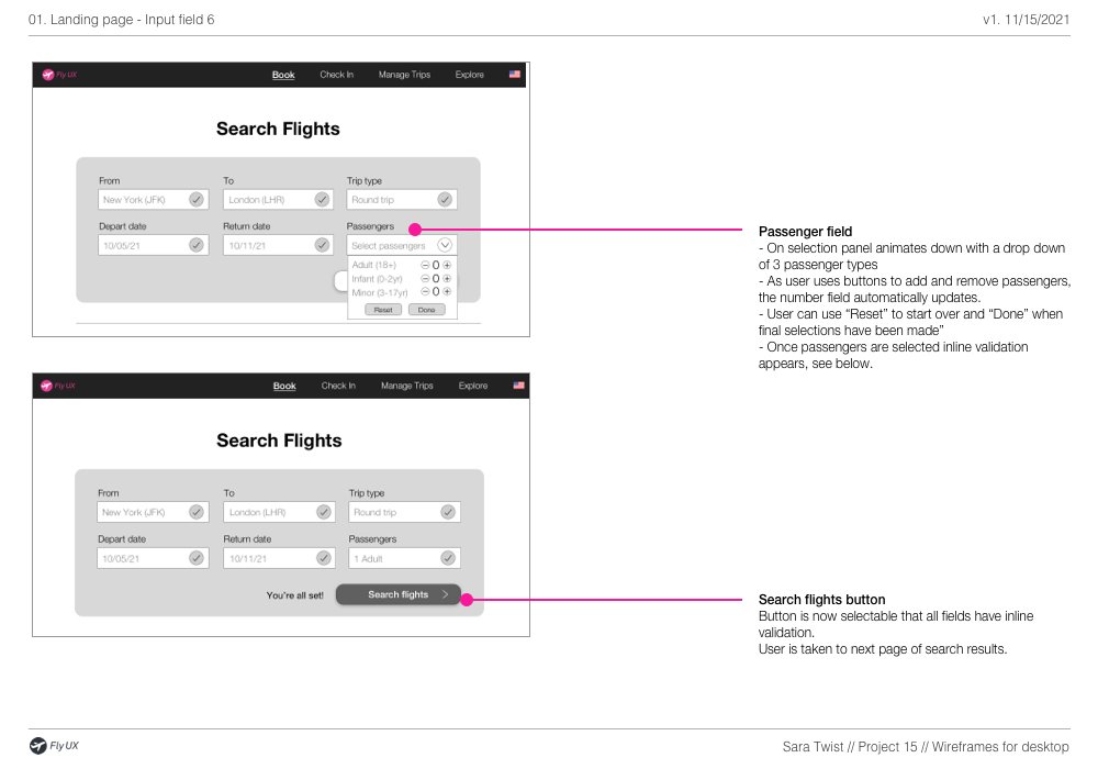
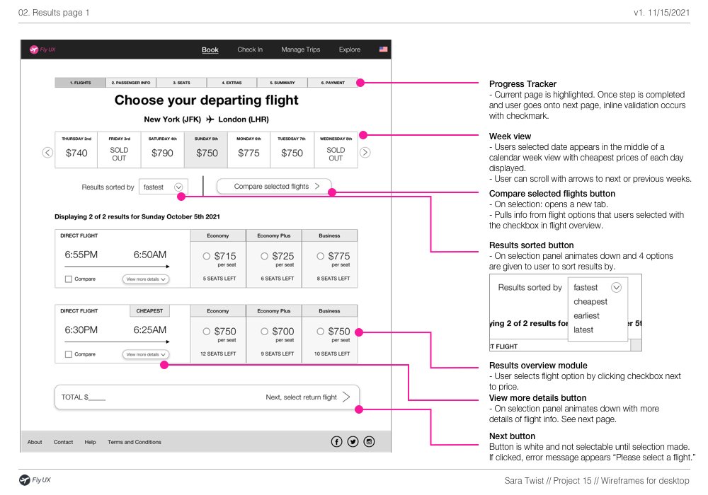
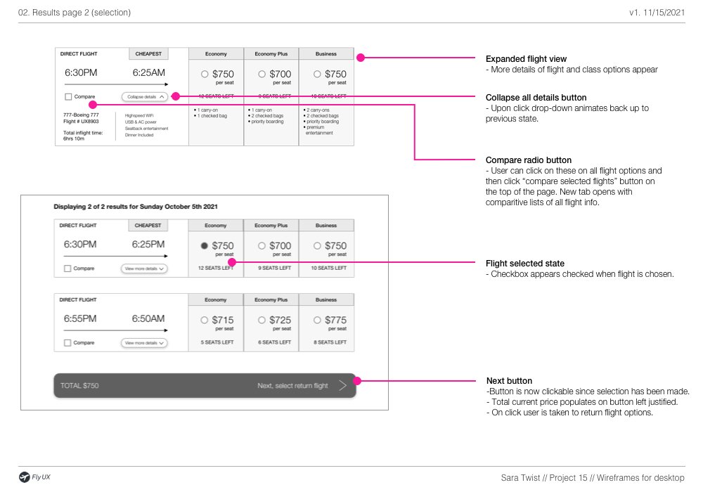
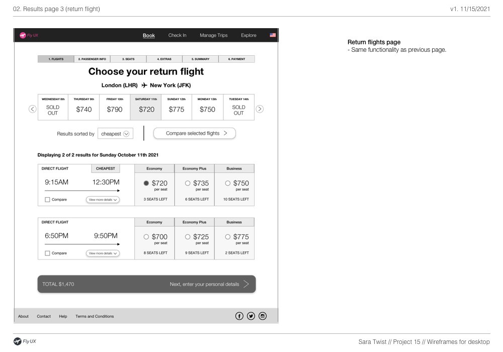
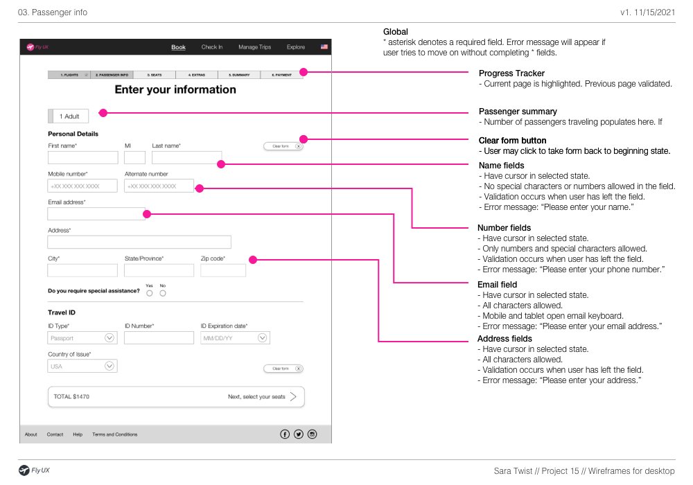
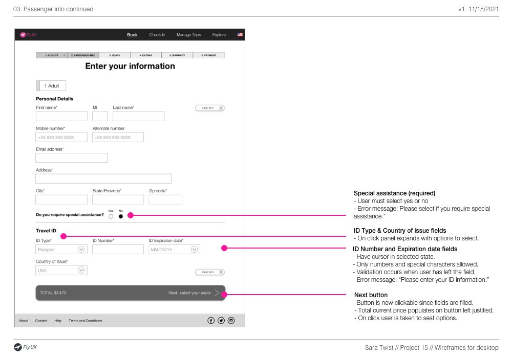
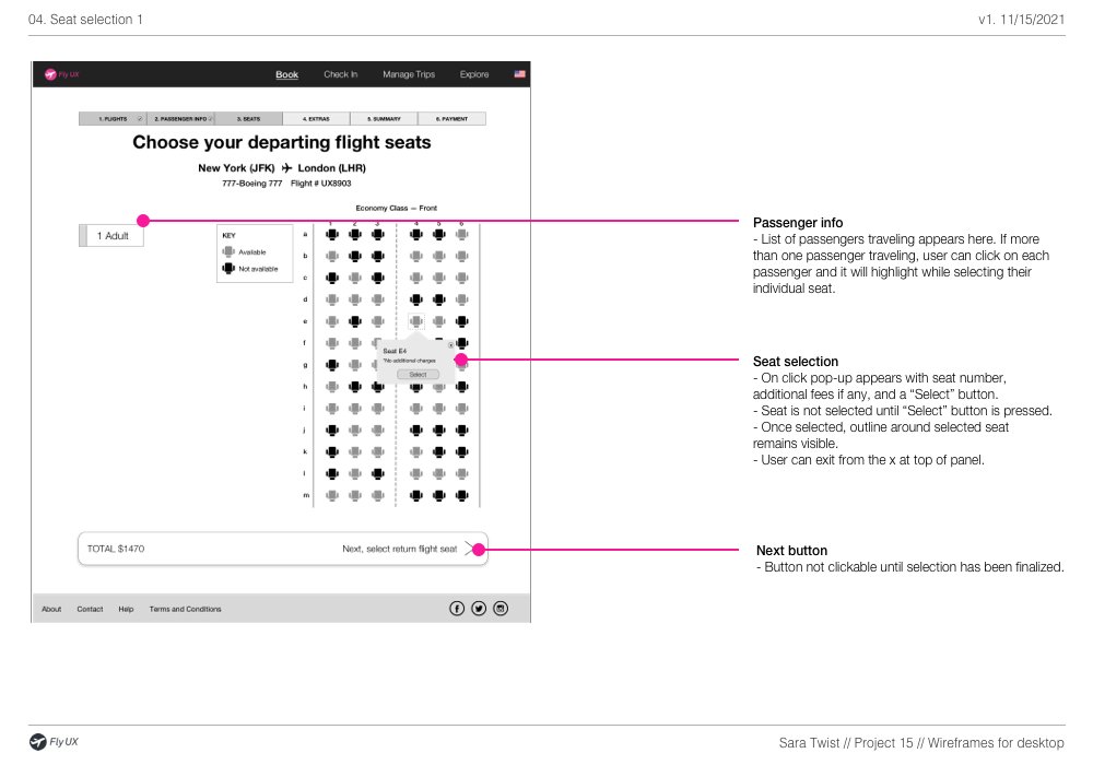
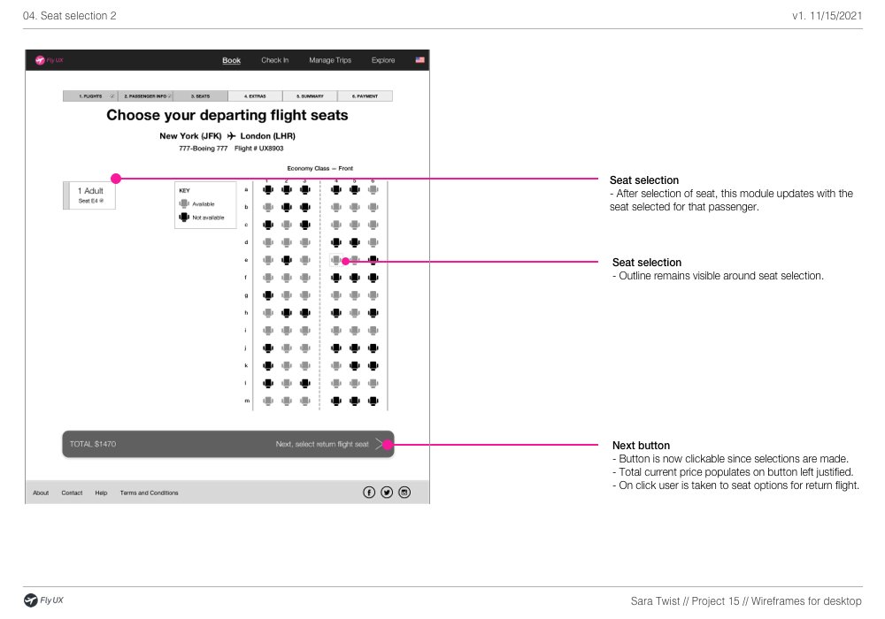
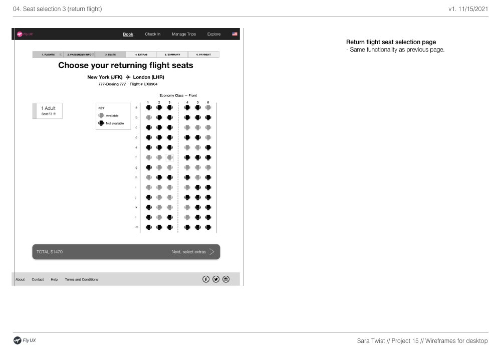
10. Wireframes
It’s now time to create a handover document to the developers and define the extra details they will need to build the product accurately.